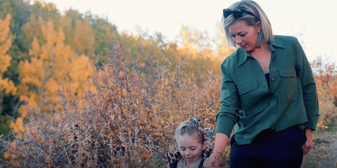
Not All Secondary Suites Are Created Equal...
Understand the Legal Requirements to Building a Secondary Suite
It is no secret that Calgary is growing at a steady rate and with this growth comes the...
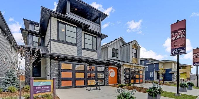
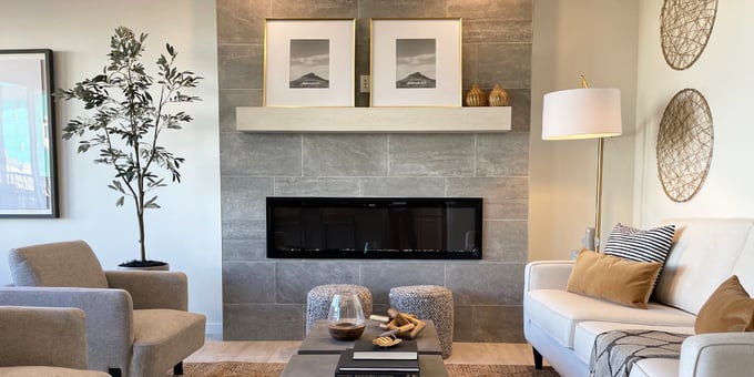
New Front-Attached Garage Showhomes in Rockland Park
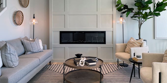
Discover Two New Showhomes in NW Calgary
It’s been a few years since we officially launched sales in Rockland Park, and since then we have helped many...
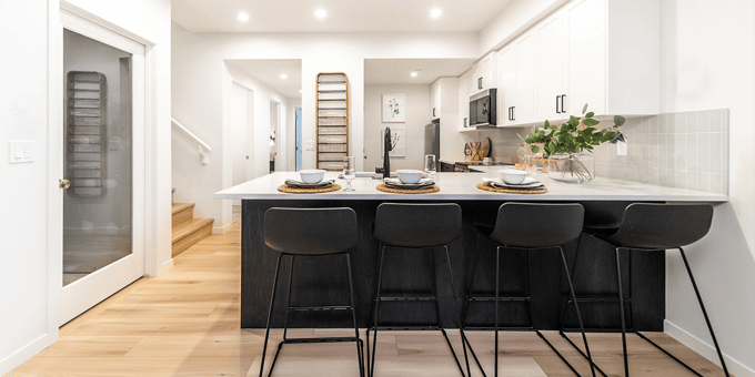
New Net Zero Certified Home in Rockland Park - Available for Quick Possession
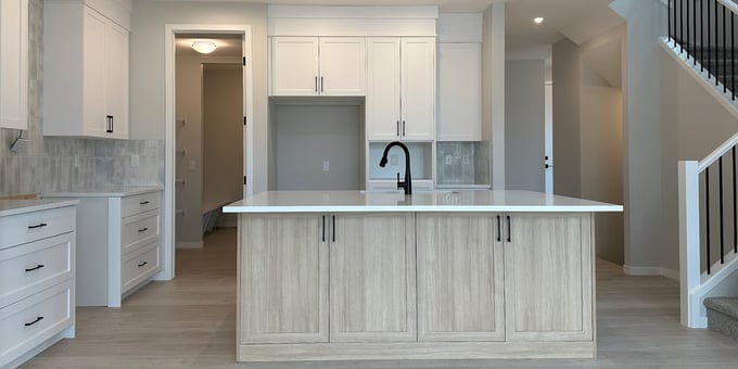
6 Rowley Gardens NW - Clairmont SSY 24
This home is a Certified Net Zero home in the master-planned community of Rockland Park. Cedarglen Homes built this...
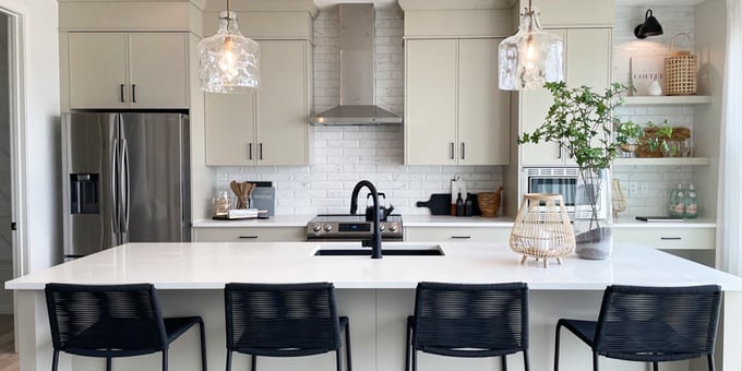
Net Zero Certified Quick Possession Home in Glacier Ridge
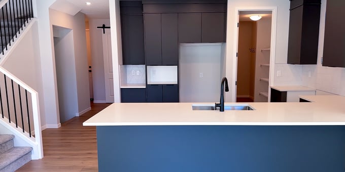
141 Edith Villas NW - Clairmont SSY 24
Cedarglen Homes is pleased to present a Net Zero certified quick possession home in the bustling new community of...
Your Homebuilding Journey Passport
Explore All Steps Involved in Your Homebuilder Journey
At Cedarglen Homes, we aim to ensure our homebuyers feel educated and empowered throughout their...
Managing Indoor Air Quality

Reduce the Smoke Build-up in Your New Home
The past few weeks have offered Calgarians plenty of hot, sunny days that have us checking into summer vacation...
Rockland Park - Sales Team of the Year
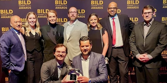
2023 BILD Calgary Region Awards
It is with great pride that we announce our Rockland Park Sales Team was awarded the Single-Family Sales Team of the Year...
Spring Festival in Cranston's Riverstone
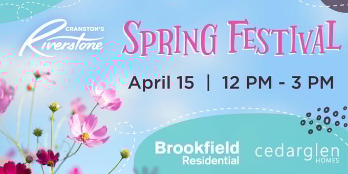
Final Opportunities to Build in This SE Community
New Showhome in Aspen Spring Estates
Explore Our Glenbow 26 Showhome in This New Southwest Community
Cedarglen Homes is proud to announce the official opening of our brand new showhome in the...
Benefits of a Side Entrance
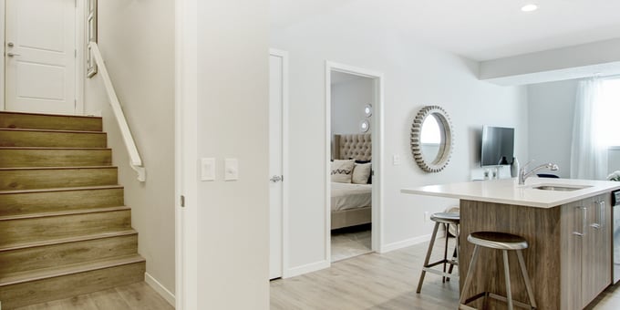
Discover Why You Might Want to Add a Side Entrance to Your New Home
One of the major benefits of building a new home is the opportunity to ensure that...
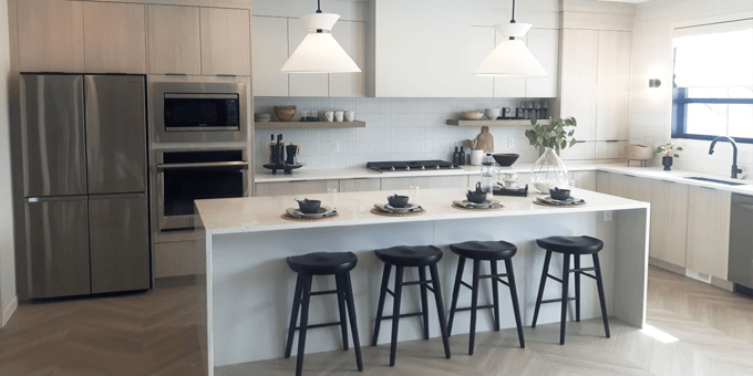
Personalizing Your New Home
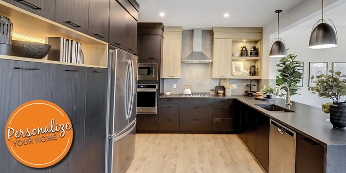
Build a Home That Suits Your Lifestyle
5 Reasons to Build in Cranston’s Riverstone
Final Opportunities to Build a Home in Riverstone
Cedarglen Homes has been a longstanding builder in Cranston’s Riverstone since it first launched in...
Season's Greetings!

Holiday Greetings from our President - Howard Tse
As the year draws to a close, we wanted to take a moment to thank our homebuyers for their continued...
How to Have a 'Green' Christmas
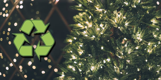
Sustainable Tips to Help Celebrate Christmas This Year
This year more than ever, sustainability has been top of mind at Cedarglen Homes with the launch of...
Explore Our Net Zero Inspired Program
5 Packages to Choose From When Building a High Performance Home
At Cedarglen Homes, we offer our homebuyers the opportunity to personalize their new homes...
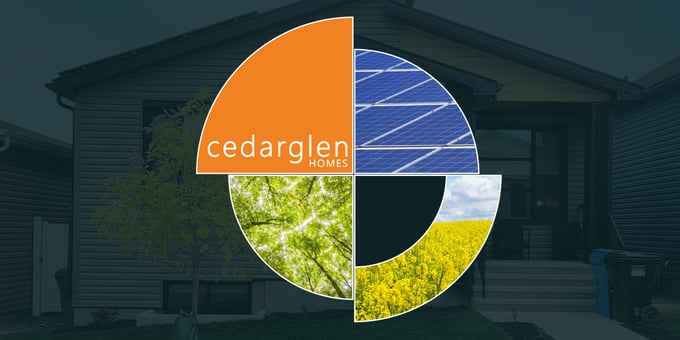
Introducing Our Net Zero Inspired Program
Get Inspired With Net Zero Homes
Now Selling in Aspen Spring Estates
Explore This New Community in Southwest Calgary
As one door closes, another opens! While we are down to our final few lots available in Encore West Grove...
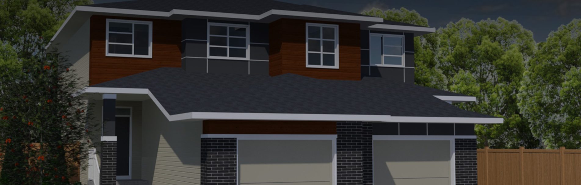
New Showhomes in Glacier Ridge
Four New Models in NW Calgary
Cedarglen Homes is pleased to announce the official launch of 4 new showhomes in the highly anticipated community of Glacier...
Two New Showhomes in Livingston
New Showhome Parade in NE Calgary
Showhome season is officially here, and after recently launching our new showhome in Belmont we couldn’t wait any longer...
New Showhome in Belmont